Stoner Plots User Guide
Although you can use the stylesheets directly in matplotlib after importing stonerplots, it is anticipated that using the stonerplots context managers will be the main way of using the package.
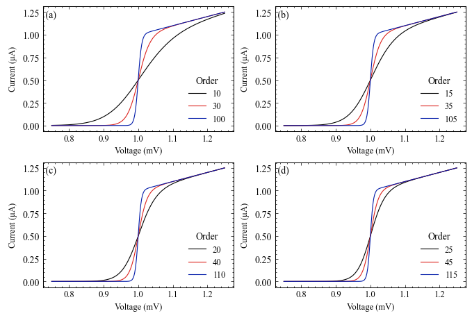
The look of the various stylesheets is demonstrated on the style gallery page.
Context Managers Primer
In Python, a context manager is used in a with … : statement. Its main advantage is that it ensures that initialisation and cleanup code are executed around the enclosed block of statements, no matter why the code block exits (e.g., due to an Exception or due to normal termination). This is generally used to ensure resources, such as open network connections, open files, etc., are opened and cleaned up properly.
For example, to open a file we might use something like:
with open(filename, "r") as data_file:
    for line in data_file:
        ...
In this case, the open() function is being used not only to open the file for reading, but to create a
context manager that will also make sure to close the file for you when execution moves out of the enclosed block.
Another reason a context manager might be used is to temporarily change something in the environment the code is
running in for the duration of the enclosed lines of code. Matplotlib offers context
managers that operate in this way to temporarily set default parameters (matplotlib.pyplot.rc_context())
or to temporarily apply stylesheets (matplotlib.style.context()).
Using Stoner Plots to Make Thesis Figures
A common task that this package is aimed towards is preparing figures for a project report, dissertation, or thesis. The task here is to try and make the figures look as consistent as possible so that your report/dissertation/thesis looks professional. You want to make all the plots have a similar format in terms of size, fonts, colours, and for the textual elements of the plot to match the main text in size and style. Matplotlib’s stylesheets help you do this, but they still need some work to set up. The other thing you will need to do is save your resulting figures to disk, preferably in a vector format that can be easily imported into your document preparation system.
We’ll assume that you already have a script that uses matplotlib to make your figures. First, you probably want to collate all the lines involved in plotting the same figure together so they can be inserted into a block.
First of all, we need to import the things we’re going to need:
import matplotlib.pyplot as plt
import numpy as np
...
from stonerplots import SavedFigure
The important line here is the final one. This will give you access to the SavedFigure context manager
that we’ll be using, but also importing anything from stonerplots will also add some stylesheets and colours to
matplotlib.
You will probably also want to set up a variable with where your figures are supposed to go:
from pathlib import Path
figures = Path("/some/path/to/your/thesis/Chapters/Chapter_1/Chapter_1_figs")
(here we are using the layout of directories that we use in our standard LaTeX thesis template.)
To now make your thesis figures, you can do something like:
with SavedFigure(figures / "fig_01", style=["stoner", "thesis"],
                            formats=["png", "eps"], autoclose=True):
    fig.ax = plt.subplots()
    ... # all your plotting commands
    ... # But don't plt.close() your figure!
When this executes you will find two files in your figures directory - fig_01.png and fig_01.eps. (If you are
using pdflatex, you might prefer to have pdf rather than eps figures). Let’s break down what that call to
SavedFigure is doing.
The first parameter is just the filename - minus the extension as we’ll be adding that by specifying the formats.
The next parameter is the matplotlib stylesheets to use. The two sheets here, stoner and thesis are included
with Stoner Plots and were made available as soon as we imported SavedFigure above. Matplotlib stylesheets
are cumulative - so what you get here is the settings from the stoner style sheet and then any changed settings
from the thesis stylesheet. These two style sheets together are designed to make a figure that fits in well with
the Condensed Matter Group’s thesis template.
After specifying the style to use, we specify the formats to save the figure files in. Here we are asking for both png and eps formats. Finally, we ask SavedFigure to close any figures opened after it has saved them with the autoclose parameter.
This is an example of a figure produced with a combination of stoner and thesis stylesheets.
For the full details see the SavedFigure Guide.
Ensuring Axes Label Formatting
Sometimes one wishes to plot very small or very large quantities. Labelling an axis with a number with too many digits or too many 0s before the significant figures can make it very difficult to judge the actual order of magnitude of the data.
The correct approach is to rescale the numbers being plotted on the axis so that they lie in the range 0.1-1000.0 and
make use of the appropriate SI prefix ahead of the physical unit. In some cases this is not possible - e.g. for
dimensionless quantities or when the scale is logarithmic. For rough working it might not be immediately obvious what
the scaling factor is going to be ahead of plotting. In these circumstances, changing the axes tick formatter to one
that can provide an appropriate SI suffix to the number can be helpful. The stonerplots package provides such a
formatter - stonerplots.format.TexEngFormatter. To make this even easier to use, the
PlotLabeller context manager will apply this for you automatically:
with SavedFigure("double-y.png", style="stoner"), PlotLabeller():
    fig, ax = plt.subplots()
    ax.plot(...) # Usually plotting commands.
PlotLabeller gets to work on exit from the context manager (if put this way round it is called before the
SavedFigure can save the figure) to set the tick label formatting as needed. The formatter can handle
numbers between 1E-24 to 1E+24 - technically further prefixes have been approved but they are little known!

Preparing a Figure for a Paper
Suppose that having got your Python code to make a nice figure for your thesis or report, you now want to use it in a paper submission. The general advice from scientific journals is to prepare your figures as vector format files at as close to the final size as you can. Unfortunately, different journals have different house styles (in terms of exact figure sizes, font size and choice and so on) - so potentially there could be a lot of work sorting out the formatting details that could be better spent writing good text.
Stoner Plots comes with stylesheets that are set up for the common Physics journal families such as APS, AIP, IEEE, etc. This makes switching from a figure for your thesis to a figure for a paper a matter of changing one line:
with SavedFigure(figures / "fig_01", style=["stoner", "ieee"],
                            formats=["png", "eps"], autoclose=True):
    fig.ax = plt.subplots()
    ... # all your plotting commands
    ... # But don't plt.close() your figure!
Here, by simply changing the style from thesis to ieee we reset the figure size, all of the fonts, and other details of the formatting.
This is what the figure looks like in IEEE format.
Double Column Figures
Sometimes a figure won’t work when fitted into a single column of a two-column journal. The Stoner Plots stylesheets include some that change the figure sizes to be suitable for 1 1/2 or 2 column formats:
with SavedFigure(figures / "fig_01", style=["stoner", "aps", "aps2"],
                            formats=["png", "eps"], autoclose=True):
    fig.ax = plt.subplots()
    ... # all your plotting commands
    ... # But don't plt.close() your figure!
Note that the extra aps2 stylesheet is used in conjunction with the stoner and aps stylesheets.
Preparing Poster or Presentation Figures
Having made your nice figures for your thesis and possibly a paper, you are likely to also want to use them for a talk or poster. Again, the use of stylesheets lets you quickly switch formatting settings to be appropriate. For posters and presentations, the main features are that you need to increase the size of all of the plot elements (lines, symbols, fonts, etc.). Generally, we use something like PowerPoint to make posters and presentations (you can use LaTeX if you have particularly masochistic tendencies!). Modern versions of PowerPoint (and other MS Office applications) do not support EPS files – due to some security concerns with the format. The best format to use is ` svg` as a vector format; the graphics will scale and print well at any size. Failing this, a high dpi png file can be used:
with SavedFigure(figures / "fig_01.svg", style=["stoner", "poster"], autoclose=True):
    fig.ax = plt.subplots()
    ... # all your plotting commands
    ... # But don't plt.close() your figure!
The poster stylesheet also increases the dpi of rasterised formats like png so that it will look good when printed on A0, albeit at the expense of rather large images!
Similarly to the poster style, there is a presentation style that makes figures suitable for placing into a standard presentation. The default is to make a plot that occupies the whole slide, but there is a presentation_sm style that keeps the font sizes, lines, etc., but reduces the size so you can fit two such plots on a slide:
with SavedFigure(figures / "fig_01.svg",
            style=["stoner", "presentation", "presentation_sm"], autoclose=True):
    fig.ax = plt.subplots()
    ... # all your plotting commands
    ... # But don't plt.close() your figure!
If you want to have a dark background for your presentation, there is a stoner_dark stylesheet that sets colours appropriately. One feature of dark plots in presentations is that the light-on-dark elements look heavier or bolder than dark-on-light, and so presentation_dark adjusts elements to make the overall weight look similar:
with SavedFigure(figures / "fig_01.svg",
    style=["stoner", "stoner_dark", "presentation", "presentation_dark"], autoclose=True):
    fig.ax = plt.subplots()
    ... # all your plotting commands
    ... # But don't plt.close() your figure!
If you need to put several graphs on the same presentation slide, then consider using the MultiPanel
context manager in conjunction with presentation mode to keep the formatting optimal for presentation viewing – do
not be tempted to make several separate figures and resize them in PowerPoint as your labels will become too small!
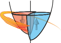
Centred Axes
Although the norm is to make figures with a frame containing ticks and axes labels, it might be that you want to
make a plot where the axes pass through the origin (or some other specific point), and in these cases you also
usually don’t put a frame around the figure. The CentredAxes context manage can do this for you:
with CentredAxes(x=xc,y=yc):
    fig.ax = plt.subplots()
    ... # all your plotting commands

CentredAxes will relocate the axes at the specified co-ordinate for all new plot (sets of
matplotlib axes) created with the context manager. The tick labels at the axes crossing points (typically
the origin) are removed and the axes labels are moved to the right and top.
Double and Multi-Panel Figures
When you want your reader/examiner to compare two related datasets with different y-ranges, you can use a double y
axis plot. With this, you place both quantities on the same plot, but one is referred to a left hand y-axis and the
second to the right. Stonerplots offers the DoubleYAxis context manager to help.
If you have several quantities that are all functions of the same independent variable, and plotting them all on a
single (or double) set of axes would be overly complex, a stack of plots with a common x-axis can be a good choice.
This can be a bit awkward to achieve in matplotlib and so StonerPlots offers the StackVertical context
manager that makes this task considerably easier.
Finally, for more general multipanel figure plotting, stonerplots offers the MultiPanel context manager to
set up the matplotlib.axes.Axes instances for you. This can also support irregular grids of panels as well
as regular ones.
Double Y Axis Plots
In this case, we have two quantities that need to be plotted on a common x axis, but the scales are rather different. Furthermore, it can be useful to colour each scale, possibly to match the dataset being plotted:
with SavedFigure("double-y.png", style="stoner"):
    plt.figure() # Create the figure in the stoner style
    plt.plot(...) # Plot the first dataset using the default left-hand axes.
    with DoubleYAxis():
        plt.plot(...) # This now works with the second y-axis on the right of the plot.
The SavedFigure context manager is doing its usual thing here (note the style can be given as a simple
string). The inner DoubleYAxis context manager creates a second set of axes which share the x-axis of the
original plot. On exit from the context manager, it can optionally colour the left and right axes and by default will
also merge legends for the two sets of data and try to locate them in the best location, taking account of both sets
of data. See Double Y-axis plots for further details.

StackVertical Context Manager
In this scenario, you have several sets of plotting lines for each quantity and just need to arrange the plots in a stack with the top of one plot being the bottom of the next:
with SavedFigure("stacked.png", style="stoner"):
    plt.figure() # Create the figure in the stoner style
    with StackVertical(3) as axes:  # create a stack of three plots
        ax1, ax2, ax3 = axes # Unpack them to separate variables
        ax1.plot(...)
        ax2.plot(...)
        ax3.plot(...)
The StackVertical context manager does the magic. When it is initially called, by default it will adjust
the figure height to make space for multiple plots. All you need to do is tell it the number of plots that should be
stacked in the figure. Again, by default, StackVertical will also label each plot (a), (b),… to help
identify each subplot in the figure caption. The return value from StackVertical is a list of the plot
axes, starting from the top of the figure.
See Stacked Plots for full details of StackVertical.
Note
StackVertical will only adjust the plot positions together when it exits - the reason for this is that
it is only when plotting is finished that it can work out how to move the plots together for the stack. In
particular, it will adjust the y-limits so that y-axis tick labels do not extend beyond the frame of the axes.
However, if the y-axis label is longer than the axis, then the plots will never be properly adjacent and manual
addition of line breaks in the axis label may be required.
Side-by-Side Multi-Panel Figures
Another common requirement is to show several related sets of data together that do not share a common variable, and
in this case, a multi-panel figure can be a good option. For this, Stoner Plots ships with a MultiPanel
context manager:
with SavedFigure("multi_panel.png", style="stoner"):
    plt.figure() # Create the figure in the stoner style
    with MultiPanel(2) as axes:  # create 2 figures next to each other
        ax1, ax2 = axes # Unpack them to separate variables
        ax1.plot(...)
        ax2.plot(...)
As with the previous example, SavedFigure handles the stylesheets and figure capture, whilst
MultiPanel creates and labels the sub-plot axes. The parameters for this are closely related to those for
StackVertical, except the initial parameter can either be a single integer (representing the number of
plots to place beside each other), or a tuple of rows, columns of sub-plots.
See Multi Panel Plots for full details of the MultiPanel context manager.
Inset Plots
The final scenario where you might need to show related datasets is where an inset is required to show a detail, or
perhaps an overview of the main plot axes. This again can be a fiddle with matplotlib to get insets that are placed
correctly without overlapping the parent axes. InsetPlot can be used here:
with SavedFigure("multi_panel.png", style="stoner"):
    fig, ax = plt.subplots()
    ax.plot(x_main, y_main)
    ...
    with InsetPlot() as inset:
        inset.plot(x_inset, y_inset)
        ...
InsetPlot doesn’t need any parameters, but it is possible to control where the inset gets placed and its
size relative to the parent axes. See Inset Plots<insetplot> for the full explanation.
- Saving Figures
- Simple Example
- Applying Styles
- Automatically Closing the Plot Figures
- Setting the Format of the Saved Figure
- Not Saving the figure
- Overriding individual settings
- Multiple Figures and SavedFigure
- Including Already Open Figures
- Adding to an already existing figure
- Security Considerations
- Setting Default Values
- Reusing the Context Manager
- Labelling Ticks
- Centred Axes
- Stacked Plots
- Multi-Panel Plots
- Double-Y-Axis Plots
- Inset Plots